What is Knowledge Exchange?
Higher education providers (HEPs), such as universities, teach students and undertake research that creates new and useful knowledge. But they also work with many different types of partner to ensure that this knowledge can be used for the benefit of the economy and society - this is known as knowledge exchange (KE).
These partners range from individual members of the public who may attend events organised by a university, to a multinational company partnering with a university to develop new medicines. The activities might include public events, allowing businesses to access specialist equipment or facilities, undertaking consultancy or licensing their intellectual property so others may use it. Providers of higher education often also play important roles as anchor institutions in their local area.
Who are Research England?
Research England are part of UK Research & Innovation. We are a public body who fund Higher education providers to undertake research and knowledge exchange. You can find out more about Research England on our main website.
How do I use the KEF dashboards?
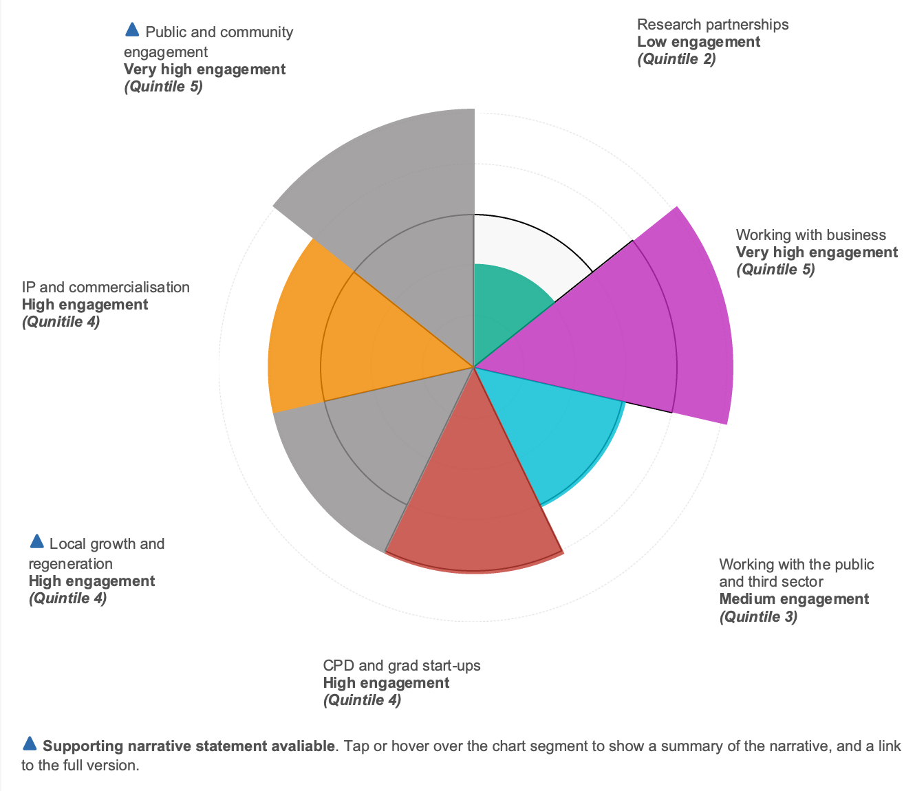
The KEF dashboards aim to provide an overview of the performance of higher education providers across seven broad areas of knowledge exchange activity known in the KEF as ‘perspectives’, displayed as a polar area chart ‘KEF dashboard’ (sample below). Each segment represents a different perspective and the fuller the segment is, the more ‘engaged’ that HEP is with that area of knowledge exchange relative to other providers. For example, in the sample dashboard below, this provider is one of the most engaged in types of knowledge exchange that relates to working with businesses, but one of the least engaged in research partnerships.
Accounting for diversity in scale and type of provider
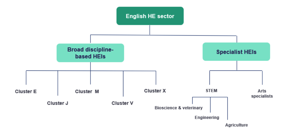
A strength of the English higher education sector is its diversity. In order to provide context for the performance of an individual provider, the KEF groups all providers into ‘clusters’ of peers – clustering together providers which have similar characteristics such as how much research they do, at what scale and in what subject areas. For example, arts specialists are clustered together.
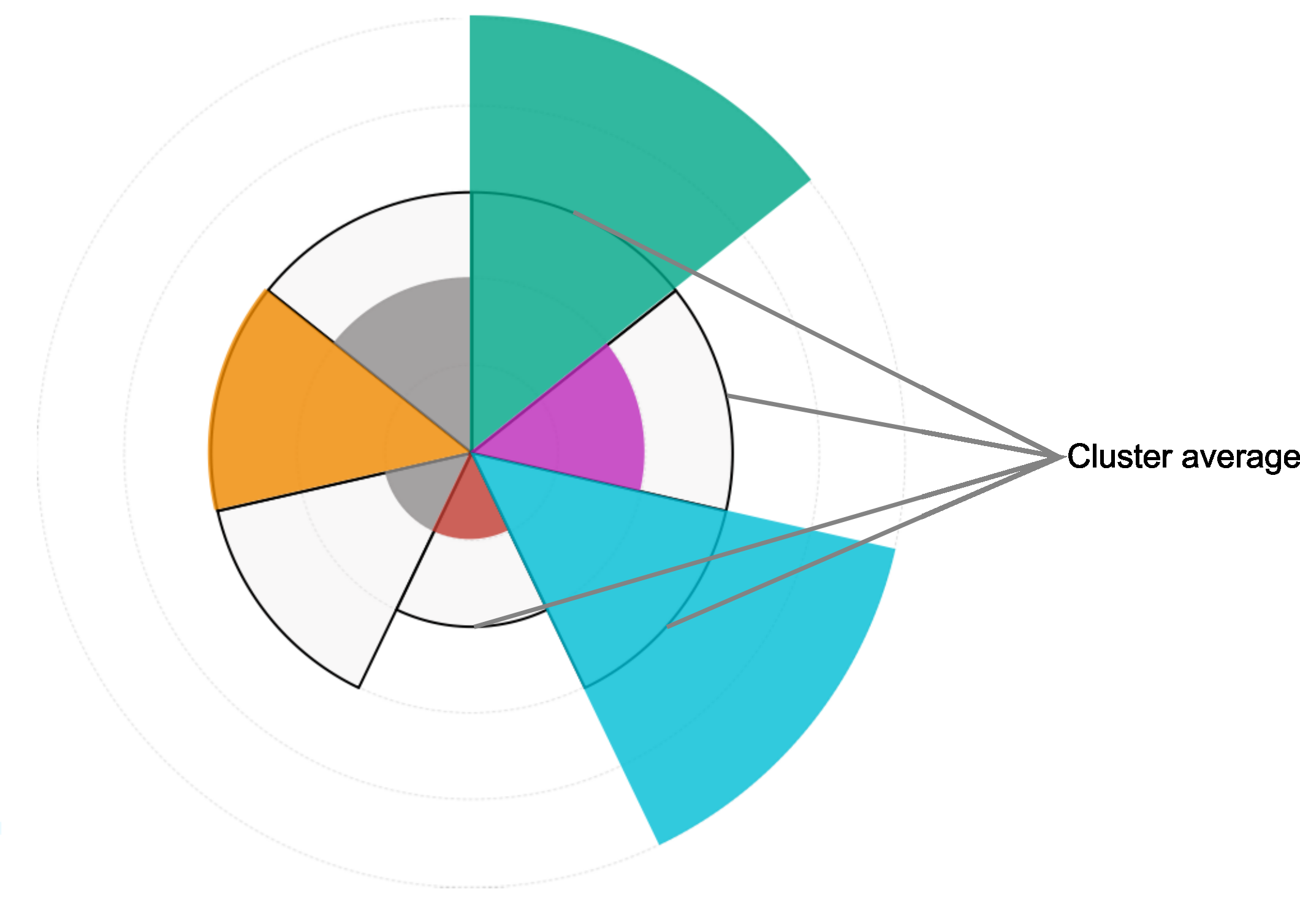
The average performance for each cluster of HEPs is displayed alongside the individual HEP’s results as a strong black line on the dashboard. So again, in the sample dashboard shown above in figure 1, the cluster average engagement level for ‘Working with business’ is only part way up the coloured segment, which indicates that the individual HEP is outperforming its peer institutions in that type of activity. However, in relation to activities that involve ‘Working with the public and third sector’ the HEP is performing at the same level as the cluster average, which can be read as a good performance for that type of provider. So, by not comparing everyone to everyone, you can better see how different types of providers perform with reference to their capacity for knowledge exchange within their type of institution.
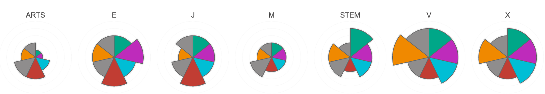
In figure 2 below, you can see that the different cluster groups have distinct profiles when you compare all the cluster averages for each perspective.
What does each perspective include?
Each perspective displayed with a coloured segment (excepting ‘Public and community engagement’ and ‘Local growth and regeneration’ shaded grey) represents a basket of between 2 to 5 metrics that each represent a knowledge exchange activity and together represent a broad area of knowledge exchange. Most of the metrics included relate to an income received by a provider where they have provided services to external partners. Table 1 below, provides an overview of the individual activities included, and where relevant the source of the income.
Detailed information about the source of the metrics is published in the KEF3 decisions document, which remain identical for KEF4.
Table 1 Summary of metrics and perspectives in the KEF
| KEF3 Perspective title | Activity being measured | Source of income to HEP |
|---|---|---|
| Research partnerships | Collaborative research income | Any external partner |
| Co-authorship with non-academic partners | N/A | |
| Working with business> | KTP and IUK grant income | Innovate UK |
| Contract research income | Non-SME businesses | |
| Contract research income | SME businesses | |
| Consultancy and facilities & equipment income | Non-SME businesses | |
| Consultancy and facilities & equipment income | SME businesses | |
| Working with the public and third sector | Contract research income | Public and third sector |
| Consultancy and facilities & equipment income | Public and third sector | |
| Continuing professional development (CPD) and graduate start ups | Continuing professional development and continuing education income | Any |
| Student/graduate start-up rate | N/A | |
| Local growth and regeneration | Regeneration and development income | Any |
| Narrative statement | N/A | |
| IP and commercialisation | Current turnover of all active firms | N/A |
| Average external investment | N/A | |
| Licensing and other IP income | Any | |
| Public and community engagement | Self-assessment of public & community engagement activity | N/A |
| Narrative statement | N/A |
What are the different levels of detail shown by the KEF dashboards?
It is important to note that the dashboards are not intended to be used to derive a single overall ‘score’ (or rank providers into a league table). We do not expect providers to be above the average score for their cluster group in every area; rather, the dashboards enable you to explore the data and descriptions of activity as follows:
-
KEF Overview level
At the perspective level, we display the performance of each provider as a quintile score indicating the level of engagement, where each quintile represents approximately 1/5 of the KEF provider population. For example, a KEF result of ‘Very high engagement (quintile 5)’ indicates that they are one of the highest performing providers in the top 20% of the KEF population.
Each perspective quintile is calculated from the three-year average of a range of metrics. The selected provider’s quintile result is displayed in relation to the average quintile result of their peer-group cluster. You can therefore see whether the selected provider is performing above or below the average for their cluster:
Detailed information about the mathematical calculations used to determine the results are provided under KEF Technical notes.
By tapping or hovering over a segment of the chart you can drill-down to more detailed information about the metrics that go to make up that perspective for the selected provider.
Institutional context
Adjacent to the polar area chart is the ‘Institutional Context’ - a 120 word summary, with a link below to read the full description. This is an introduction to the organisation, such as their mission, strategic priorities, areas of strength etc.
Who are Cluster […]?
Below the Institutional Context is the ‘Who are Cluster […]?’ summary, this is a description of the key characteristics of the cluster of the selected provider.
-
Perspective level
At the perspective level, the individual metrics that make up the perspective quintile score are displayed as bar charts, with the selected provider shaded in the perspective colour, showing the three-year average for each of the metrics that make up the perspective quintile.
A dotted horizontal line on each chart denotes the cluster average for that metric. Note that the bars are scaled relative to all providers for each metric and not just those in the displayed cluster (i.e. 100% is the highest value across the sector, while 0% is the lowest, irrespective of the actual minimum and maximum values for the metric).
-
Metric level
At the metric level, detailed information about a single metric is displayed for the selected provider in the following formats:
- Relative performance - Scaled bar chart showing the selected provider’s three-year average compared with other cluster members.
- Trend data - Line graph showing the performance against the metric for the selected provider over a three-year period.
- Annual performance relative to cluster – Sortable table showing how metric performance has changed over the last three years for all members of the cluster.
-
Perspective narrative statements
For two of the perspectives, Local Growth and Regeneration and Public and Community Engagement (shaded in grey, flagged with a blue triangle), the currently available metrics are limited. We therefore asked providers to provide additional narrative to help explain their work in these areas.
Following the detailed KEF review in 2021 Research England confirmed that narrative statements would be updated approximately every three years. The narratives displayed in the current KEF were submitted for the KEF3 in 2023 and therefore relate to activity undertaken in the period 2019-20, 2020-21 and 2021-22. KEF4 will continue to display the narrative statements that were submitted for KEF3. It has not been confirmed when the next narrative update will be incorporated, but there will be no updates made to narratives statements until KEF6 (2026) at the earliest.
The narrative statements can be accessed by hovering over the perspective segment and following the link provided (max 2,500 words).
The narrative statements are designed to be factual, evidenced statements, and are structured to allow comparison between providers, with each statement providing information about their:
- Strategies and the needs they have identified
- Activities that they undertake to address the identified needs
- Results and impacts of their activities
Detailed information about the narrative statements and the guidance provided to HEPs to prepare them was published in 2022. Research England have commissioned the National Co-ordinating Centre for Public Engagement (NCCPE) to undertake a detailed review of the Public & Community Engagement narratives in 2024 as an evidence base for Research England’s future development of the Public & Community Engagement perspective.
-
Clusters
Here you can find an overview of all seven KE cluster average polar area charts, enabling you to compare the relative strengths of each. By selecting one of the cluster charts along the bottom of the screen, the page will display the membership and cluster average quintile results for each perspective in the selected cluster.
Clustering for fair comparison
The purpose of clustering is to group the KEF participants into KE clusters that have similar capabilities and resources available to them to engage in knowledge exchange activities.
It is important to note that the KE clusters are not ranked in any way – the clusters are not a ranking in themselves – they are intended to promote fair comparisons between similar sorts of providers in a very diverse sector.
The initial clustering analysis was undertaken in 2018 and this was updated in 2023 to take account of the most recently available data, including from the Research Excellence Framework (REF2021). An excel export of the updated clusters was published in June 2023 and more detailed information about the clustering process is provided under KEF Technical notes and the full details may be found in this report.
A downloadable Excel file of providers by cluster was published alongside the 2023 KEF3 decisions report. The KE clustering of HE providers (HEPs) used for KEF4 will remain the same as those used for KEF3.
-
Select a provider
This function enables you to search for a given provider either by typing part of the name in the search bar and pressing enter, or by clicking on the interactive map of providers by location.
Once your selected provider’s full name appears in the search results, select the name and click on the pop-up hyperlink or select ‘KEF overview’ in the menu bar to see the overview dashboard for that provider.
-
Comparing providers
This function enables you to select two different providers, either from the same cluster or different ones and see their high-level perspective dashboard side by side. Select or hover over individual perspectives to see further detail of the metrics for either provider. Care should be taken when comparing providers from different clusters – you should always think about their performance relative their cluster.
How did the KEF come about?
The below timeline provides a brief overview of the history of the development of the KEF, including links to key documents published through the development process.
KEF development timeline
-
September 2024
KEF4 is launched
-
September 2023
KEF3 is launched
-
June 2023
KEF3 decisions report published including updated KEF3 cluster placements and data sources
-
May 2023
Updated cluster analysis published by the University Commercialisation and Innovation Policy Evidence Unit
-
May 2023
Research England publish document related to the KEF – Knowledge exchange funding review: decisions and implementation
-
November 2022
KEF3 narrative guidance and templates published
-
September 2022
KEF2 is launched
-
May 2022
-
February 2022
-
March 2021
Publication of the first iteration of the KEF.
-
October 2020
Deadline for participating providers to submit narrative statements to Research England.
-
April 2020
We published a circular letter outlining the revised timescales for the KEF to allow for the disruption caused by Covid-19 pandemic.
-
March - April 2020
We hosted two webinars to assist higher education providers who are participating in the KEF with their preparations.
-
March 2020
We published final detail of the KEF cluster descriptions and cluster placements. We also published templates for the submission of KEF narrative statements.
-
January 2020
We published the KEF decisions report setting out how we will implement the first iteration of the KEF and detailed information about the data sources that will be used and the methodology for presenting the data.
-
August 2019
We published a report detailing the outcomes of the KEF consultation and pilot workshops.
-
March - May 2019
We held five KEF pilot workshops with 21 volunteer HEIs from across the sector.
-
January 2019
We published a consultation on proposals for the KEF. This included an invitation to participate in a series of pilot KEF workshops.
-
November 2018
We (Research England) published a technical report of a cluster analysis of English Higher Education providers to inform the development of the KEF.
-
April 2018
Research England assumed responsibility for the development of what was to become known as the Knowledge Exchange Framework (KEF) as part of its wider KE policy and funding remit.
-
November 2017
Minister of State for Universities, Science, Research and Innovation commissioned the Higher Education Funding Council for England (HEFCE) to provide more information about higher education provider’ achievements in serving the economy and society for the benefit of the public, business and communities.
Who can I contact if I have further questions?
Please email KEF@re.ukri.org.